Amsterdam overview
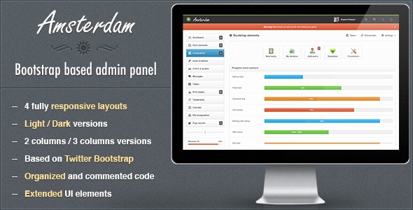
Amsterdam admin template is a responsive template built with Twitter Bootstrap for backend panels, suitable for cms systems, web apps and other control/billing/hosting panels. Includes 4 main responsive layouts in dark and light versions. 2 of 4 layouts have 3 columns version.
Amsterdam is fully compatible with iPad and iPhone devices.
The template is based on 12 columns grid and is very flexible, keeping the main content part the same is very easy to change the general look and color theme.
PSD files aren’t full, only 2 included – general ui components and dark colors layout, almost everything was designed in browser.
Please, if you found any bugs, strange look or have any suggestions – don’t hesitate to let me know, i will do my best to fix those issues as soon as possible. Usual support available: Mon – Fri, 9:00 – 20:00 CET
Enjoy!
Some features
3 columns layout
2 versions have 3 columns layout for wide screens.
Advanced bootstrap components
Contains advanced modal and progress bar plugins
Error pages
Contains a bunch of error pages ready to use
Bootstrap icons
Font Awesome and Glyphicons included
4 layouts
Unboxed dark responsive layout
Boxed light responsive layout
Unboxed light responsive layout
Growl like notifications
Styled Growl like notifications
Main navigation
Dark and light navigation depending on layout color scheme
And much, much more…
Full features list
Liquid 2 or 3 columns layout
Light / Dark layouts
2 / 3 columns
Boxed / Unboxed layout versions
Integrated Flot charts:
Lines
Bars (vertical and horizontal with tooltips)
Pies
Auto updating chart
Threshold charts
Filled charts
Form elements:
Full set of input fields with default stylings.
Appended, prepended elements
Textareas options: counter and elastic
Tags input
Full set of HTML5 inputs
Masked inputs
iPhone like toggle switches
Styled dropdowns: Uniform and Select2 plugins with options
Styled and unstyled checkboxes and radios
Stacked pills, stacked tabs
Radio and checkbox buttons
2 directions form related buttons
WYSIWYG editor
Dual multiple selects with filter feature
4 forms versions: default (block), inline, transparent and horizontal
2 label positions for controls
Fields validation
Light and dark form elements for sidebar
3 types of wizards: with ajax submit, with standard submit, with validation
Set of inputs grid
Components:
5 types of middle navigation elements: usual buttons, buttons with background, pie charts, 2 types with Font Awesome icons
jQuery sliders set
jQuery UI datepickers: default with input field, inline liquid, inline fixed, icon trigger, dates range
Color picker with options: HEX format, RGBa format, as a component.
Timepicker with options: with duration feature, 2 time formats
Set of navbar elements:
Collapsible wigets: opened and closed by default
Progress bars
Input fields
Buttons in 2 positions and sizes
Toolbar tabs
Pager and pagination
Links list with dropdowns
Labels and badges
Glyphicons and Font Awesome icons: only icon or icons list with dropdowns
Caret only dropdown
Datepicker input
Toggle checkbox, toggle radio
Simple icons list
Toolbar with smaller font size for heading
Toolbar
Navbar form elements
Simple loader
Some examples of custom usage of Bootstrap and jQuery UI elements
Styled Growl like notification for success, warning, error and info messages
Animated gif loaders
Tooltip in 4 positions
Bootstrap components:
Progress bars with options:
Filled with text
Starting with delay
Unfilled
With centered text inside
With value
With tooltip
Horizontal and vertical
Slim and wide
Top, bottom, right, left directions
4 colors for success, info, warning, danger
Left, right, top, bottom, navbar (left and right aligned), toolbar tabs with optional fade effect
4 sizes pagination: left, center, right aligned
Pager: boxed and unboxed
Media lists and media objects
6 options for well element:
Well large
Well default
Well small
Well smoke
Well white
Nested wells with subtitles
Breadcrumbs
2 navbars: light, dark with elements
Scrollspy example
Accordions and toggles
Labels and badges
Alerts in 4 colors: line notifications, block notifications, general top notifications
Popovers in 4 directions
Modals:
Alert, confirm and prompt dialogs
Multiple dialogs
Programmatic close
Generic modal
Dynamic content
With iconified buttons
Override alert and confirm icons
Callbacks
Prompt with default value
Buttons and icons:
8 default button colors
5 button sizes: block with 100% width, large, default medium, small, mini
Vertical and horizontal button groups
Button dropdowns: top and bottom directions, splitted and standard
With icons: Font Awesome and Glyphicons
Font Awesome and Glyphicon icons
Basic and advanced thumbnails
12 columns responsive content grid with offset
Charts:
Default line chart
Vertical and horizontal bars
Threshold chart
Filled chart
Pie chart
Auto updating chart
Sidebar line chart and horizontal/vertical bars
2 layouts for messages: timeline and chat
Calendar with schedule
Tables:
Default without side borders
Striped table
Bordered table
Bordered table inside content
Hover class
Condensed table
Transparent table
Datatable
Table with footer
Table with gradient
Table with checkboxes
Table with toolbar
Tabbed table
Error pages:
403 error
404 error
405 error
500 error
503 error
Website is offline
Typography:
Headings and default css stylings
Syntax highlighter
Left and right blockquotes
Emphasys styles
8 default list styles
Horizontal and vertical descriptions
File manipulations:
File manager
Multiple file uploader with drag and drop functions
Tabbed page
Changelog
Version 1.0 released
Version 1.1 released
Updated Bootstrap version
Updated Sparklines plugin
Added “Check all checkboxes” functionality to the table
